


Hello crafters! This past weekend I received some happy mail including a stamp set that I've had my eye on from Sunny Studios called Fresh & Fruity. I stamped up all of the little fruits and just started coloring. Once I had colored the pears, this card just kinda came to fruition.

For the pears, I used my Copic markers to create a color fade from rosey pink to pear green. Once they were all blended they needed some kind of shine on them. I was thinking glossy accents but I wanted something that had a bit more texture. I decided to try clear embossing powder. I used a sponge dauber with sticky ink and only embossed half of the pear first. I then went in with another coat of sticky ink over the whole image and embossed it again. It gave a more realistic look to the pear. Here's a close up of the colored pears and the copic markers I used.

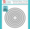
Next I started working on the card base. I grabbed a piece of black card stock and a stitched circle die. I cut it a bit off the page so that it would highlight the image more. I then embossed the sentiment using some Ranger Liquid Platinum powder. I really like the look of this color. It's not quite gold not quite silver. It's a perfect mix and a bit on the warmer tone.
I knew I wanted some color behind the pears so I grabbed purple and green distress inks and started blending them. The colors looked nice, but I felt it needed something more. I grabbed a dot stencil and a baby wipe and gently rubbed the wipe over the stencil to remove a tiny bit of color. I loved how it turned out. It created this neat halo effect on each dot and really gave the background that little something extra. I adhered the back pear flat down and popped up the top pear with foam tape. To ground the images, I drew in a little ground shadow with some warm gray Copics. Here's a close up of the window and finished pear images.

So I really thought at this point I was done with the card. When I started taking pictures, it seemed to be missing something. There was just too much black. So I grabbed some black and white washi tapes and added a little border to the opposite side of the card. That truly completed the card.
I was pretty happy with the way this design turned out. I think it would be a neat wedding card or anniversary card. It's not your traditional color scheme and I like that. I hope you enjoyed this card and I'll see you next time! Have a great week!
Supplies:


No comments:
Post a Comment